


Anti-Israel activists often use doctored maps to show Israel’s supposed malfeasance over the past century. Such claims are made by people who, in the best case, have no knowledge of the facts, and in the worst case, have no moral compass.
You can’t walk very far on an American or European university campus these days without encountering some version of the “Palestinian Land Loss” maps. This series of four—occasionally five—maps purports to show how rapacious Zionists have steadily encroached upon Palestinian land. Postcards of it can be purchased for distribution, and it has featured in paid advertisements on the sides of buses in Vancouver as well as train stations in New York. Anti-Israel bloggers Andrew Sullivan and Juan Cole have both posted versions of it, and it occasionally creeps into supposedly reputable media sources, like Al Jazeera English.
Indeed, it recently appeared as a “Chart of the Day” in the UK’s respected magazine New Statesman. Beneath it was a tiny line of text listing its sources as the UN Office for the Coordination of Humanitarian Affairs and a CIA atlas from 1973. Given that the maps included information far more recent than 1973, the source struck me as slightly dubious. I contacted the staff writer who created the feature and asked him about it. He was very reluctant to admit that he had lifted it from anti-Israel propaganda sources, so he directed me to the 1973 CIA atlas. Unfortunately, nothing like the series appears in the CIA World Factbook and nothing like it could have appeared in an atlas published decades before several of the events it claims to portray. The writer then apologized for not being able to track down his sources any further and explained that he no longer works at New Statesman. He has moved on to The Guardian, and given that particular publication’s attitude toward Israel, he should have no trouble fitting in.
There is a reason why those who make use of these maps avoid examining their provenance or proving their accuracy: The maps are egregiously, almost childishly dishonest. But they have become so ubiquitous that it is worth taking the time to examine them, and what their dishonesty can teach us about the Palestinian cause and its supporters.
In whatever form they take, the “Land Loss” maps show very little variation. The standard version looks something like this:
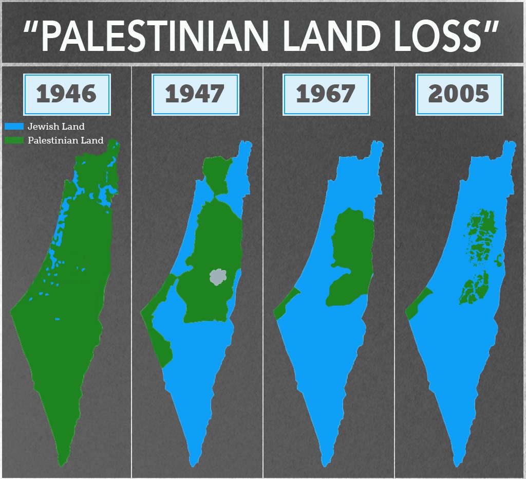 Sometimes, a fifth map is added, this one dated 1920, showing the entirety of what was once British Mandatory Palestine in a single solid color, labeled “Palestinian.” This accomplishes the seemingly impossible and makes the series of maps even more dishonest than before.
Whether made up of four or five maps, the message of the series is clear: The Jews of Palestine have been assiduously gobbling up more and more “Palestinian land,” spreading like some sort of fungal infection that eventually devours its host.
There are some outright lies in these maps, to be sure. But the most egregious falsehoods transcend mere lies. They emerge from a more general and quite deliberate refusal to differentiate between private property and sovereign land, as well as a total erasure of any political context.
This final point is especially crucial. It goes to the question of whether the Palestinians actually “lost” this land and the context of that alleged “loss.” We could quite easily, for example, make a panel of maps showing German “land loss” in the first half of the 20th century. It would be geographically accurate but, without the political context, it would tell a completely misleading story amounting to a flat-out lie. And that is precisely what these maps are: A lie.
Taking each map in turn, it is easy to demonstrate that the first one is by far the most dishonest of the lot. As far as I have been able to determine, it is based on a map of Jewish National Fund (JNF) land purchases dating roughly from the 1920s. The JNF was founded to purchase land for Jewish residents and immigrants in then-Palestine, and was partly funded through charity boxes that were once found in almost every Jewish school and organization in the West. Ironically, this map often adorned those ubiquitous boxes.
These maps have become so ubiquitous that it is worth taking the time to examine them, and what their dishonesty can teach us about the Palestinians and their supporters.
The dishonesty of using an out-of-date map for pre-1948 Jewish land purchases is actually relatively minor. So is not omitting the political context: After 1939, Jews were forbidden from making any further land purchases by British authorities, a measure taken as a sop to Arab terrorism. Even the deceptive use of JNF land and only JNF land as a proxy for the entire Palestinian Jewish presence is but a trifle compared to the epic lie represented by this map: It deliberately conflates private property with political control.
They are not at all the same thing. The simple fact is that none of pre-1948 Palestine was under the political authority of Arabs or Jews. It was ruled by the British Mandatory government, established by the League of Nations for the express purpose of creating a “Jewish National Home.” It was also—contrary to the claims of innumerable pro-Palestinian activists—the first time a discrete political entity called “Palestine” existed in modern history. And this entity was established in order to fulfill a goal that was essentially Zionist in nature.
But this lie is compounded by another that is even more epic in scope: Labeling every single patch of land not owned by the JNF as Arab or Palestinian. This was quite simply not the case. We have incomplete data on land ownership in modern Palestine, and even less on Arab property than Jewish property, partly due to the very complicated nature of property law in Ottoman times. But anyone’s map of private property in Mandatory Palestine from this period would be mostly empty—half the country is, after all, desert. It would show small patches of private Jewish land—as this map does—alongside small patches of private Arab land, as this map shamelessly does not.
The next map is labeled 1947. This is inaccurate, as any other date would be, because the map does not represent the situation on the ground in 1947 or at any other time. Instead, it represents the partition plan adopted by the United Nations General Assembly in 1947 as UN Resolution 181. It called for two independent states to be formed after the end of the British Mandate, one Jewish and one Arab.
Needless to say, the resolution was never implemented. It was rejected by a Palestinian Arab leadership that just two years before had still been allied with Nazi Germany. The day after its passage, Arab rioting began against Jewish businesses, followed by deadly Arab attacks against Jewish civilians. Events quickly escalated into all-out war, with Arabs laying siege to major Jewish population centers—cutting off all supplies, including food and water. In some places, the siege worked, but for the most part, it was resisted successfully.
The maps emerge from a more general and quite deliberate refusal to differentiate between private property and sovereign land, as well as a total erasure of any political context.
At this point, with partition rejected by the Arabs and no help from the international community in sight, the Jews declared independence and formed what would become the Israel Defense Forces. The Arab states promptly launched a full-scale invasion, whose aims—depending on which Arab leader you choose to quote—ranged from expulsion to outright genocide. And the Arabs lost. At war’s end in 1949, the situation looked roughly like the third map in the series—the first of the lot that even comes close to describing the political reality on the ground.
I say “close” because it too is remarkably dishonest. It is only because one’s standards of dishonesty have been stretched so far by its predecessors that it almost seems true. But, alas, it is not. The map is dated 1967. What it shows are the so-called “armistice lines,” i.e., the borders where the Israeli and Arab armies stopped fighting in 1949. These lines held more or less until 1967. As far as Israel’s borders are concerned, then, the map accurately presents the situation over those 19 years.
But what lies on the other side of the line, in the territories that are today called the West Bank and the Gaza Strip, is again presented in radically dishonest fashion. These lands were not—not before, during, or after 1967—“Palestinian” in the sense of being controlled by a Palestinian Arab political entity. Both territories were occupied by invading Arab armies when the armistice was declared in 1949, the Gaza Strip by Egypt and the West Bank by Jordan. The latter was soon annexed, while the former remained under Egyptian military administration. This status quo lasted until 1967, when both were captured by Israel.
In the 1967 Six Day War, which was marked by Arab rhetoric that was sometimes even more genocidal than 1948, Israel also took the Golan Heights from Syria and the Sinai Peninsula from Egypt, more than trebling the amount of land under its control. Israel has since withdrawn from more than 90 percent of the land it occupied—mostly in the Sinai withdrawal that led to peace with Egypt. Unsurprisingly, there are no heartfelt “Israeli Land Loss” maps representing this.
The first three maps, then, confuse ethnic and national categories (Jewish and Israeli, Arab and Palestinian), property and sovereignty, and the Palestinian national movement with Arab states that ruled over occupied territory for a generation. They are a masterpiece of shameless deception.
Shameless deception is the only thing that remains consistent in this series.
As we move to the fourth map, shameless deception is the only thing that remains consistent. This map, usually labeled either 2005 or “present,” purports to show the distribution of political control following the Oslo process and the Israeli withdrawal from Gaza. The patches of Palestinian land in the West Bank are areas handed over to the Palestinian Authority in the 1990s, mostly under the 1995 Oslo II agreement. Expanding upon the autonomy put in place after previous agreements in the Oslo process since 1993, this agreement created a complex patchwork of administrative and security zones, splitting the West Bank into areas of exclusive Palestinian control, joint control, and Israeli control. It was meant as a five-year interim arrangement, after which a final status agreement would be negotiated.
Final status talks did indeed take place. But no agreement was reached. As in 1947, the principal reason was Palestinian rejectionism. This time, the Palestinian leadership rejected a state on over 90 percent of the West Bank and 100 percent of the Gaza Strip. They then broke their pledge not to return to the “armed struggle” and embarked on a campaign of suicide bombings and other terrorist atrocities that were not only morally indefensible but lost them the trappings of sovereignty they had gained over the previous decade.
After tamping down the worst of the violence, Israel decided to leave the areas of the Gaza Strip it had not evacuated a decade before. The withdrawal took place in 2005. Two years later, the Islamist group Hamas took over the Strip in a violent coup d’etat. Since then, there have been two Palestinian governments—the Hamas regime in Gaza and the Fatah-led regime in the West Bank.
Both of these regimes are marked with the same color on this fourth map, thus failing to acknowledge the split between the two regimes, though it is the first map in the series to correctly label areas under Palestinian Arab political control. Nonetheless, it does not distinguish between the sovereign territory of the State of Israel—or, in the case of East Jerusalem, territory that Israel claims as sovereign without international recognition—and territories in the West Bank that, according to agreements endorsed by both sides, are under Israeli control until a final status agreement.
Taken together, what we have is not four maps in a chronological series, but four different categories of territorial control presented with varying degrees of inaccuracy. Those categories are private property (“1946”), political control (“1967” and “2005”), and international partition plans (“1947”). They are presented in a fashion that is either tendentiously inaccurate (“2005”), essentially mendacious (“1947” and “1967”), or radically untrue (“1946”).
An honest approach would look very different. It would take each of these categories and depict how they developed over time. For example, basing ourselves on the most blatantly deceitful map, 1946, we might want to show the chronological development of private property distribution. But we’d first have to adjust the original series’ 1946 map by labeling only Arab property as Arab, rather than simply filling in the entire country with the desired color. It would be a lot of data to collect, and then we’d then have to repeat the effort for other years appropriate to the discussion: Perhaps 1950, after Israel and Jordan both instituted Absentee Property Laws; 1993, just before Palestinian self-rule began; or 2005, just after the disengagement from Gaza and the northern West Bank. The maps would have to be consistent as well, showing Arab property inside Israel as well as Jewish property in the West Bank and Gaza. I don’t know if anyone has bothered to collect all this data, and I’m not sure what it would show in any case. What argument would it advance? That Jews and Arabs should be forbidden to buy land from each other?
On the other hand, the categories of political control and international partition plans are quite easy to map out over time. Since the concern of those publicizing the maps above is Palestinian control of land, we can illustrate this with a more honest series of maps showing areas of political control, using the same years as the original—adding one for clarity.
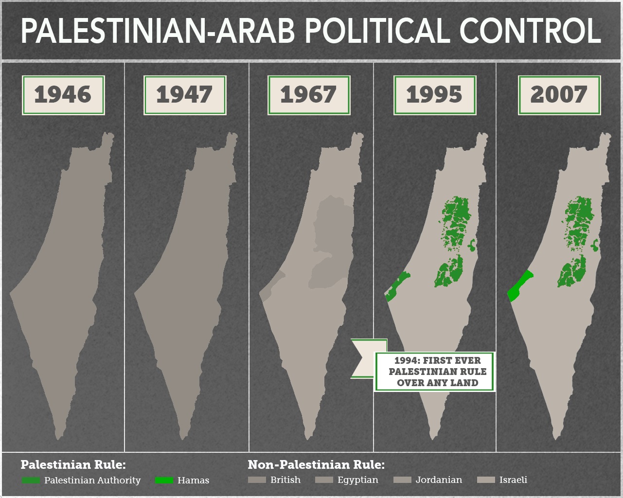
As seen above, 1946 has exactly zero land under Palestinian Arab control—not autonomous, not sovereign, not anything—as it was all under British authority. We could go further back in time, to the Ottoman era, for example, and the map wouldn’t change in the slightest. 1947 sees no changes to the map, as Palestine was still under British control. Before the war in June 1967, control is divided between three states, and none of them is Palestinian. The 2005 map would be exactly as it is presented in the original series, showing the very first lands ever be ruled by Palestinian Arabs qua Palestinian Arabs. To clarify this a bit more, I have added a map from 1995, showing the withdrawals undertaken during the first two years of the Oslo process, just up to but not including the 1997 Hebron Protocol.
In fact, if we zoomed in a bit more, we would see how the peace process of the 1990s resulted in the first time a Palestinian Arab regime ruled over any piece of land. This occurred in 1994 with the establishment of the Palestinian Authority in Gaza and Jericho. That control steadily expanded over more and more land during the years leading up to the failed final status talks. Much of it was then lost during the second intifada, but eventually regained as violence died down, and the Gaza disengagement even expanded it slightly. All of these Palestinian land gains have taken place in the last 20 years and every square meter of it came not from Turkey or Britain or Jordan or Egypt, but from Israel alone; and nearly all of it through peace negotiations.
It is true that this is a smaller amount of land than that controlled by Israel—which is nonetheless an extremely small country by global standards. More importantly, however, it is small compared to what could have been ruled by a Palestinian state had the Palestinians not rejected partition and peace in 1947 and again in 2000. That is, had the Palestinians been motivated by the interests of their own people rather than the wish to destroy another people.
One could very easily create a theoretical series of maps that would begin in 1947 and show the distribution of political control, not as it existed, but as it could have existed. In contrast to the previous series charting political control over the years, this series would map out the international proposals to partition the country. It would begin with the Peel Commission’s 1937 partition plan, through the United Nations Special Committee on Palestine (UNSCOP) partition resolution, and end with the Clinton Parameters of 2000—which were very close to the rejected offers made by Israeli Prime Ministers Ehud Barak earlier that same year at Camp David and Ehud Olmert eight years later. But these international efforts to partition the land would be incomplete without a word or two about each side’s reaction to the proposal.
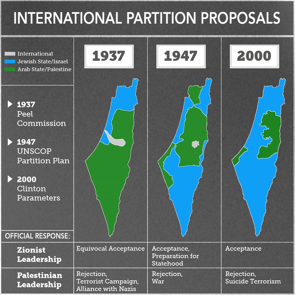
Here too there is a continuing trend of losses for the Palestinian side. Not loss of land, but loss of potential. Each successive rejection left the Palestinians with less and less to bargain with. Surely, there is a lesson in this. But it seems that, if the Palestinians are ever to learn it, it will not be with the help of their Western supporters.
We could also make a set of maps that would present a story of Jewish “land loss.” It would begin with the first iteration of the British Mandate, before Transjordan was split off and Jewish land purchases and immigration banned. We are forever being reminded that the Palestinians have supposedly conceded 77 percent of their historic claims already, implicitly saying that all of Israel proper somehow belongs to them. But territorial maximalists on the Israeli side are not wrong when they use the same standards to claim that they have given up 73 percent of what was promised to them, including Transjordan. It is the business of pro-Palestinian activists to privilege one of these claims over the other; but in fact, both are equally wrong: The idea that the Israeli “concession” of Transjordan entitles Israel to 100 percent of the West Bank is as absurd as the Palestinians’ claim that their “concession” of Haifa entitles them to the same.
A series of actual Israeli withdrawals, however, could fill a rather long series of maps. It would include the 1957 withdrawal from Sinai, the Disengagement of Forces agreements in 1974 and 1975, the staged withdrawals stemming from the Israeli-Egyptian peace treaty in 1979 and 1982, the withdrawal from most of Lebanon in 1985, the staged withdrawals undertaken according to the Oslo Accords from 1994 to 1997, the unilateral withdrawal from southern Lebanon in 2000, and the complete withdrawal from Gaza in 2005. These maps, unlike those used by pro-Palestinian activists, have the benefit of being accurate, but I am not sure the case for “Israeli Land Loss” would convince anyone but the most partisan and ignorant of Israel’s supporters.
Perhaps the best way to illustrate the bankruptcy of the “Palestinian Land Loss” myth is to compare it to a similar situation elsewhere.
An equally absurd set of maps could be drawn up of the Indian subcontinent before and after the end of British rule. It could start with a 1946 map of the entire subcontinent, labeling any private property owned by Hindus as “Indian” and the rest as “Pakistani.” Hindus, after all, are 80 percent of India’s population today, just as Jews are 80 percent of Israel’s. It is absurd to consider anything not privately owned by Hindus under British rule as “Pakistani” when the state of Pakistan did not yet exist, but that is roughly the same as labeling anything not privately owned by Jews under the Mandate as “Palestinian.”
We could then put up a partition map from 1947, with West and East Pakistan next to a much larger India; as well as a post-partition map—perhaps from 1955—showing the land losses along the Radcliffe Line. Finally, we could draw a map from 1971 with East Pakistan shorn off into Bangladesh. A fervently dishonest person might call this series “Pakistani Land Loss,” but it would be such an obvious piece of fiction that no one could possibly take it seriously.
And no thinking person can take “Palestinian Land Loss” seriously. It is just as absurd and just as much a fiction. But it is also, in its own way, extremely destructive. Because these maps and the lies they propagate only encourage Palestinian rejectionism and violence; and as illustrated above, these have always left the Palestinians with less than they had before.
![]()
Banner Photo: Stephen Coles / flickr